Grow Your Small Business With These 7 Website Design Best Practices

If you run an established business and have a terrific product, a strong brand identity, and a solid marketing plan, you’re already ahead of most small businesses.
But if your business is struggling or you’re planning to start a new business, you must ensure that customers and prospects can easily find your business website and that the website is designed for an excellent customer experience.
Today, every business must create a website design that will convert visitors into sales.
This is no longer optional. A recent study shows that 97% of consumers research their purchases online before they buy something.
Your website is a crucial component of your marketing and branding strategy. Customers visit your website because they have a particular purpose in mind – they need something from you – and your website should help make them feel comfortable purchasing a product or service from you.
If you have a poorly designed website, the chances are good that you’re losing a chance to turn researchers into loyal customers. Branding statistics unequivocally show this to be true. Make sure you’re not giving up thousands of dollars in revenue and get your website functioning the way you need it to.
Having said that, some business owners worry that website design prices can be prohibitively high.
Many design companies and agencies indeed charge thousands of dollars for their services. But this isn’t universally true (crowdspring’s custom website design projects start at just $899, including all fees).
Here are 7 important website design best practices for businesses that want to convert prospects into customers.
1. State your business clearly.
2. Make your value proposition simple.
3. Have a clear call to action.
4. Offer clear support/customer service information.
5. Offer third-party validation/testimonials.
6. Be trustworthy.
7. Focus on your customers’ needs (not yours).
Let’s review each of these best practices to understand how you can improve your own website.
1. State your business clearly
Don’t make site visitors dig for what you’re all about. Make it clear up front why your business exists and what it does.
Many landing pages handle this basic task well, but you still find sites that obscure the “what” behind confusing industry jargon.
2. Make your value proposition simple
Studies show you have scant seconds to capture a site visitor’s attention. Write in simple, clear language why people should care about your business or your product.
You already did this when you created a business plan for your business. Now, it’s a matter of creating a more crisp, concise statement about your value proposition.
Want a free brand review? Answer 5 short questions and we will send a custom report with actionable insights and specific actions you can take to build a stronger brand.
We just emailed the info to you.

We just emailed the info to you.
3. Have a clear call-to-action
As we previously wrote,
The call to action (CTA) on your homepage is an important element to draw visitors deeper into your site. You should consider a few important factors when you design your CTA, including: (a) location (above the fold – visible on the monitor when the page first loads is typically ideal), (b) make sure the CTA stands out from the other content on your site (notice how the crowdspring “START A PROJECT” CTA is pink?), (c) create a link to another page so that your call to action will draw the visitor deeper into your site, (d) create a less-emphasized alternative variation (notice the “How it works” link below crowdspring’s primary CTA, (e) and test design, content, and placement.
Once you’ve hooked your visitor, make sure you give them a clear next step.
What is the primary action you want customers to take when they come to your site? You might want them to:
- Buy a product,
- Read an article,
- Install an app,
- Click a link,
- Watch a video,
- Request more information, or
- Share with a friend
Whatever it is, highlight that action on the page, and then optimize the page’s design to make it clear that’s the next step.
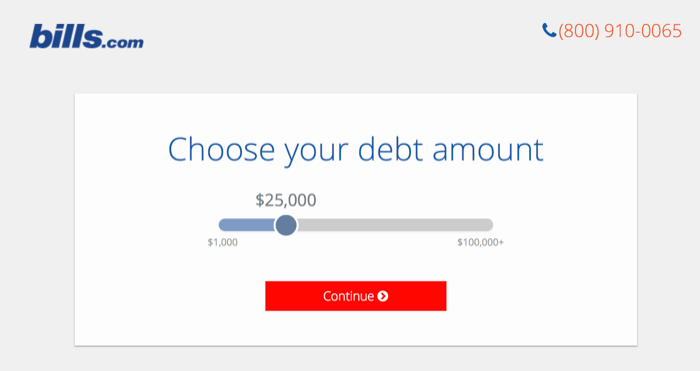
bills.com is a great example of a site with an obvious call to action. The only items on the page are a large slider and continue button – you can’t do anything else.
However, keep in mind that this is one instance where a better statement of purpose might help: Okay, choose my debt amount. But why? That could be clearer.
4. Offer clear customer support information
Assure customers that you’ve got their back if they run into issues or need help. Make the service and support contact information visible on the page, giving customers an easy way to get in touch with you.
This is especially helpful for companies that sell services or products. Customers want to know that if something goes wrong, they have options for getting assistance.
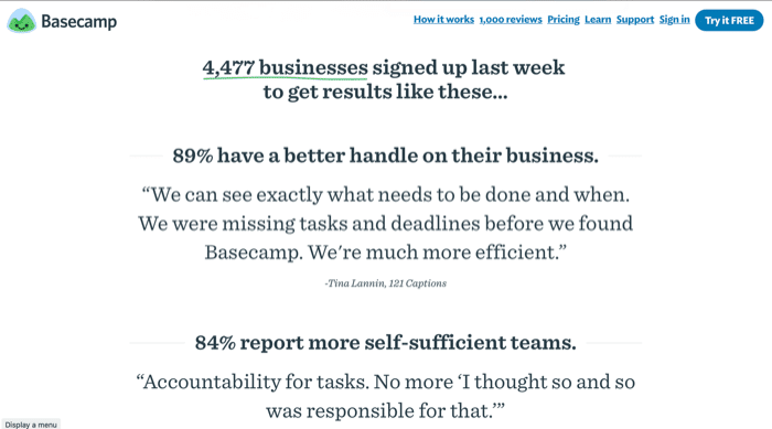
Project management and collaboration service Basecamp effectively merges testimonials with statistics on their website. You see compelling numbers (like how many businesses signed up in the last week) with quotes from actual users supporting some impressive statistics. The rest of their homepage is worth a look, too – there are many good ideas here.
5. Offer third-party validation and testimonials
People often trust other people’s opinions – they crave social proof. You don’t have to look further than Amazon’s wealth of customer reviews to see this at play. The challenge is having testimonials that customers trust, which can be difficult. People often read testimonials with a skeptical eye.
To give your testimonials a head start in gaining your customer’s trust, there are a few best practices you can follow.
Make your testimonials specific and value-based
Basecamp’s testimonials are so compelling because they’re specific, and they describe the value the company or individual gained from using the product.
If you’re going to use a well-known name, make it a relevant one
Everyone has seen celebrity endorsements for products, and often using a recognizable name can bolster a testimonial’s value. But make sure the name fits with your product. Using a famous name with no correlation or credibility with your product’s audience can backfire and make you seem less trustworthy.

Email productivity service Sanebox gives its testimonial weight through the use of a well-known person (who undoubtedly gets a lot of emails and would benefit from Sanebox’s service) and a headshot to help cement the name recognition.
Put a face (or a logo) to the name
The cliché that a picture says a thousand words holds for testimonials as well. If you use the recommendation from a well-known name, pair it with their photo. That will help customers recognize the person, and the photo gives their words more weight – and helps legitimize the testimonial.

Astro includes a small selection of logos from sites covering the app and does the right thing by linking the logos to the related article or review.
If you’re using a blurb or testimonial from a company or media source, include their logo. The field of logos can increase credibility, especially if the logos link directly to that publication’s review or article.
Video testimonials can be compelling
Words, headshots, and logos may be effective tools, but including video testimonials can really drive home the value that others derive from a product.
ChowNow has its own page of recommendations but leverages high-production video interviews and concise, snappy summaries to excellent effect. Not only do these serve as testimonials, but they also showcase how real people use ChowNow. That’s a great way to introduce a product through real-life scenarios and give potential customers ideas about how it might fit their workflow or life.
Offer onsite and third-party testimonials
It’s excellent to offer testimonials directly on your own website. For example, crowdspring has a customer testimonials page highlighting some of the customers who love our service. But we also direct people to independent, third-party pages, like the crowdspring reviews page on ResellerRatings.
6. Be trustworthy
Customers may not be as wary about spending money online as they were a decade ago, but that doesn’t mean you don’t have to work to gain their trust. Unless your product is incredibly sought after, you still need to create an environment that encourages trust.
There are a couple of ways you can make your site more trustworthy:
Have clearly visible contact information
People want to know that there’s a real business behind the website. Providing contact information (whether it’s email, phone, or links to your social media pages) reassures customers that if they ever need to get in touch with someone, there’s a way.
Only take what you need
When you need to get information from your customers, only ask for what you need, and make it easier for them to provide it. Concise forms and using shortcuts that make completing longer forms easier avoid putting your customers into the position of wondering why you’re asking for so much stuff.
Once you’ve established a relationship with a customer, you can then get more information as needed. At first, however, the fewer bits of information a customer needs to provide, the better they’ll feel.
7. Focus on your customers’ needs (not yours)
Small businesses without a large marketing budget might be tempted to build their own website.
Sometimes this works out okay, but it’s a delicate line to walk.
It’s important to make sure that your website serves your customer’s needs above all else, and if you don’t have the skillset to create something fully functional for your users, it’s best to hire a professional.
Emily Bracket, president of design and branding firm Visible Logic, said in an interview with Small Business Trends:
I hear it all the time from business owners who tried to build their own websites. They felt so proud and it was such a great learning experience. But the fact is that customers don’t care what a great learning experience it was. They only care that your website looks professional. So even if you worked really hard on it, if it doesn’t look professional it can be detrimental to your business.
Don’t let your own experience overshadow your customers’. Ensure that your website is professional, functional, and fully in service to what your customers need to feel confident in your company.
Once your first business website is live, feel free to pat yourself on the back. It’s an important step!
But don’t get complacent: a company’s website should never rest on its laurels and should always seek to improve itself as your business grows.
Make sure you take care to adjust for things like SEO and changing design trends and always remember to keep your customers’ needs at the forefront of your mind for your business’s website.

Design Done Better
The easiest way to get affordable, high-quality custom logos, print design, web design and naming for your business.
Learn How to Grow Your Business With Beautiful Design