5 Dental Logos That Will Brighten Your Smile

{{CODE2000000}}
There are many dentists and dental practices in the world.
Still, most suffer from a common problem that limits their ability to build a strong brand identity: their logos are generic and, in most cases, composed solely of clip art.
As we wrote previously:
One of the best parts of a logo, assuming you’re not using generic templates, is that it can only be associated with your business. It doesn’t matter if a different company is similar to yours, what matters is that your logos are different. As a result, you have an opportunity to make a unique first impression. Often, a logo is one of the first defense barriers against competition. Besides your company’s name, it’s the first difference customers and prospects will notice. That’s why it’s important to avoid generic and cliche logos.
In fact, we’ve regularly cautioned against using generic branding.
Think about your experiences with a dentist or orthodontist. Do you remember their logo? Chances are you don’t.
Most dental logos involve an illustration of a tooth with a glyph or shape and some text – usually in blue. And while at first, this makes sense when there is no differentiation between these basic shapes and images, it’s easy for logos – and your brand – to get lost.

We just emailed the info to you.
You would think that by now, the dental industry would catch on to the trends of logo design and the importance of branding. However, a quick Google search reveals that the industry is still stuck selling their logo best practices as boring, blue tooth logos.

This is disappointing because, just like real estate companies, dentists and orthodontists all have unique things that make them different. While they all work with mouths and teeth, some focus more on kids while others specialize in certain types of services.
Some dentists focus on using the latest dental technologies, while others stay old school. Whatever the differences, it’s important to celebrate those differences in your branding. As we previously wrote about the importance of standing out in another industry, real estate:
In today’s world, missing an opportunity to leave an impression with your prospective customers usually means missing out on business. With so much competition and the surge of websites that help people find, sell, and buy houses, blending-in is the worst thing that you can do for your company. Therefore, it’s important to brand your business and use a strong, unique logo. By following the example of companies with famous logos, you can focus on what makes your business different instead of what makes your business the same.
Once you start focusing on the key differences, you can focus on standing out.
If you want to be lost in the sea of other dental practices, you don’t really need to worry about this. You can stop reading now.
But if you’re starting a new business, want to be remembered and recognized in your community, and hope to build a strong dental practice, it’s in your best interest to take a look at some of the logo trends, designers, or other resources available to you – because it may be time to rethink your logo.
And this isn’t just important for dental practice owners. This is just as important for logo designers, especially those working on dental logos. When an industry is stuck in a rut, it is much harder for designers to help companies break out of it. Luckily, not every dental practice has lost sight of a unique logo design.
Now, some business owners worry that the cost of logo design can be prohibitively high.
Many design companies and agencies indeed charge thousands to tens of thousands of dollars for their services. But this isn’t universally true (crowdspring’s custom logo design projects start at just $299, including all fees).

If you’re still not convinced why you need a unique dental logo for your practice, or you’re a dental logo designer looking for some inspiration, check out some of our favorite dental logo designs we’ve seen on crowdspring.
Bassham Family Dental

We love this logo by freshcreative for Bassham Family Dental. While the colors may still follow the blue trend, there are two different logo variations, and the colors are softer. The logo has organic lines and friendly, open font. This logo does a great job communicating the family-oriented focus that this practice is based on.
Affordable Braces

Again, the logo for Affordable Braces uses blue. However, this blue is a bit brighter than usual, and there is no generic tooth illustration to be seen! Designer hrouhani does a great job combining typography with illustration by giving the middle part of the A some braces. It’s creative, simple, and minimal. These elements help tie in together the main focus of affordability.
Energetic Smile

And finally, the blue cycle is broken by designer Arijita_b. This logo for Energetic Smile offers a fresh twist on the typical blue dental logo. Like Affordable Brace’s logo, Energetic Smile’s logo combines typography and some light illustration to bring some energy and friendliness to the simple font. The bottom part of the E was slightly modified to turn it into a smile. It’s simple, effective, and clearly reinforces the company’s name.
Dental Loft

Another great dental logo we saw was this minimal logo design for a Dental Loft. At first glance, the illustration part looks like some lines, probably combining to make a building. But designer eirini actually took a toothbrush, simplified it, turned it on its side, and modified it, so it was both a toothbrush and slightly building-like. This way, it combines both parts of the company’s name while keeping the logo modern and clean.
Hilborn Family Dentistry
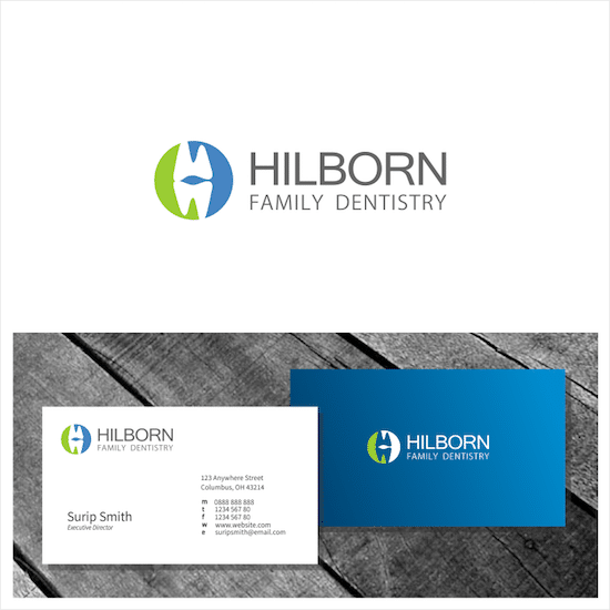
But sometimes, you can’t seem to get away from the classic tooth. Like real estate logos, having a generic symbol doesn’t always have to be boring or forgettable, as surip demonstrates. In this case, Hilborn Family Dentistry’s logo combines the generic tooth and turns it into the H of their name. It’s another play on typography and illustration, a trend that seems to work well for dental logos.
Now you can see that not all dental logos have to be boring or outdated. In fact, many of the best dental logos are simple, clean, and very modern.
When you focus on what makes you special and lose the traditional mindset, clients will remember your dental practice. And if you’ve decided that your existing logo is bland and boring, don’t worry. Now may be the perfect time to rebrand.

Design Done Better
The easiest way to get affordable, high-quality custom logos, print design, web design and naming for your business.
Learn How to Grow Your Business With Beautiful Design