The Ultimate Guide to Creating A Successful Landing Page for Your Business [Tips + Examples]
![The Ultimate Guide to Creating A Successful Landing Page for Your Business [Tips + Examples]](https://images.crowdspring.com/blog/wp-content/uploads/2022/10/26045822/sven-q0ksjwr55jc-unsplash.jpg)
The landing page is a beautiful thing. It exists for one purpose – to convert.
Whether you’re looking to turn prospects into subscribers, clients, members, or customers, the humble landing page has your back.
What is a landing page?
A landing page is a standalone web page designed for people to visit when they click a link in a marketing or advertising campaign.

Over the past fifteen years, our team has helped thousands of entrepreneurs and small businesses build and improve their landing pages. We’ve keynoted numerous conferences and webinars on building landing pages and frequently write and talk about landing pages and conversion optimization on our blog and at conferences. This guide shares the actionable insights, tips, best practices, and expertise we’ve developed after helping over one hundred thousand brands.
We’ve put together proven tips to help you create a landing page that converts visitors into customers.
Let’s start with the basics (advanced content follows).
Critical elements of a successful landing page
Landing pages can be powerful tools. A successful landing page helps with the following:
- grow conversion rates
- boost brand awareness
- provide more insight into your business
In a study by Marketing Sherpa, 43% of marketers reported that dedicated landing pages are highly effective, and 49% of marketers said they are somewhat effective. That’s a consistent endorsement.
But dedicated landing pages can only deliver if they are correctly designed.
While there is no such thing as a perfect landing page, there are definite dos and don’ts. Before diving into the more advanced stuff, we must ensure that you have a solid foundation of every landing page must-have key elements.
All landing pages should include these three elements:
The call-to-action
A call to action (or CTA) is your landing page’s single reason and driving force. Every landing page must have one single goal. This could be to subscribe to your newsletter, download your free e-book, sign up for your service, or purchase your product.
But you only get one. If you place more than one demand on your viewers, they will feel conflicted and leave.
The call to action is when the proverbial rubber hits the road. It’s the simple act of requesting a prospect to act. And it provides the motivation prospects need to convert.
Support your CTA with testimonials. Testimonials are crucial to adding social proof to your landing page. Highlight a variety of testimonials focusing on different aspects of your product and service. And be sure that each testimonial contains enough detail to help visitors decide whether to buy from you.
Clear, concise communication
On a landing page, distraction is the enemy. All extraneous material should be cut from your landing page design. Every graphic and word should be carefully considered. And only those that drive prospects to sign-up, download, subscribe or buy (depending on your goal) should make the cut.
Aim for concise language that communicates your point. Prospects should be able to determine what’s in it for them and what they must do to take advantage quickly and easily.
And aim for a friendly and aesthetically pleasing design. The visuals you use on your landing page are vital to its success. You don’t want to confuse people by overdesigning your page or boring them with no designs. The trick is to find the balance between your brand’s aesthetic and ensuring that your designs are not taking away from the original goal of your landing page.
Simple, actionable tools
A landing page is an “ask.” It invites potential subscribers, clients, members, and customers to do something you want them to do. The least you can do is make it easy for them to follow through on your request.
Provide easily visible, well-labeled buttons and forms in prominent locations. Everything the prospect needs to act should be right at their fingertips.
You can see these principles in the wild with this landing page from Digital Marketer:
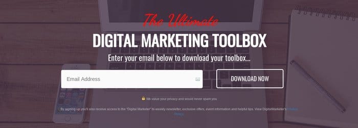
Concise language, a clear call to action, and a simple interface… They’re all here.
But to take your landing page from functional to high-performing, you must incorporate all these design elements and more.
From the 50 thousand-foot views, only two additional elements are needed to boost your landing page’s performance: positive user experience and meeting the prospect’s needs.
Of course, delivering a positive user experience and meeting your prospect’s needs are big tasks. So, let’s break down what each of these might look like, with examples to show you the right way to do this.
We just emailed the info to you.
Positive user experience
What makes a consumer’s experience positive? Internet viewers have come to expect websites to be fast, intuitive, and easy to navigate. These are the things to keep in mind when designing a landing page.
So, keep your prospects happy with these tips for improving brand experience.
Keep it quick
Positive user experience starts with a fast webpage load time. Slow load times may prevent your user from having much experience because they’ve already clicked away. As we previously shared:
There are few (no?) resources more valuable than time. So, it should come as no surprise that the more time a consumer has to spend waiting for your website to load, the less happy they are. In fact, a Kissmetrics Infographic shows that by the time your website hits 4 seconds of loading time, you’ve already lost 25% of your potential viewers.
For those that do stick around, slow loading times have already decreased their satisfaction with their online experience. In other words, you’ve either lost customers or made a poor first impression – either way you look at it, that’s not good.
So, optimize your landing page for speed. Follow our advice from above, use clear, concise language, and eliminate any possible distractions, and you’ll already be on the right track to creating a quick load time.
Here are a few other tricks you can use to ensure a speedy page load:
- Minimize the number of components on your page to limit the number of HTTP/HTTPS requests
- Optimize your server to ensure a quick response time.
Keep it clean
Keep your landing page design streamlined and clean to make it 100% clear to your prospects what you want them to do.
Anxiety decreases conversions. As Dale Cudmore cautions:
Would you go down a dark alley in Chicago late at night? No, because it wouldn’t feel safe.
And while your website might not be a dark alley, if it produces any anxiety in any segment of your visitors, your conversion will suffer.
One of the easiest ways to reduce stress is by making the path forward very, very clear. Think of it as the equivalent of adding bright streetlights along the length of that Chicago alley. Cudmore explains it this way:
In addition to having a great value proposition, you also need to communicate it effectively. This is done in part by your copywriting, but also in your formatting and layout (design).
…A high-converting website leads visitors from the most important element to the second most important element, to the third, and so on…
So, avoid complex designs, busy background images, or other visual distractors. Here’s an excellent example. This landing page is for TechSmith’s screencasting software Snagit:

Minimal text, simple graphics, and plenty of white space keep this design clean and easy to follow. The bright orange call to action button is placed prominently at the center of the page.
They also entice you to scroll beneath the fold by allowing their social proof (“Join Over 14 Million Snagit Users”) to peek out at the bottom of the screen. But, many viewers won’t even feel the need to scroll, reassured that 14 million other users already exist. They’ll click “Buy Now” and move on with their day.
Keeping your website design streamlined and with a focus on the call to action helps the viewer know what is expected and, as such, eliminates anxiety. And less anxiety for your viewers means higher chances of leading them into the conversion funnel.
Keep it easy
Everyone likes easy.
Nowadays, most of us have a million items on our to-do lists. Anything that can be accomplished easily gives us hard-core warm fuzzies.
Not to mention, when the going gets tough, many people just walk away. (Hello and goodbye, New Year’s Resolution!) Making it easy for prospects to act on your call to action increases the likelihood of doing it. It will also make them feel good about the experience.
Richard E Cytowic, M.D. reflects that self-esteem…
…must be earned through individual effort. It is the endeavor that generates a sense of pride and inward esteem.
You can create positive feelings in your visitors by making it easy for them to accomplish your call to action. Completing a task – even a small one – can boost a person’s esteem. So, set your visitors up for success!
- Provide a short, clear headline that grabs attention and confirms that the prospect has found the page they were seeking.
- Are you using an info-gather form? Keep it short. Only ask for the info you need.
- Make your call-to-action buttons easy to find. Use color and surround buttons with plenty of “white” space.
Providing your users with a positive experience will increase the likelihood of converting. It will also build trust and goodwill for your brand – and that’s worth so much more than a single subscription or sale.
Meet your prospect’s needs
Ultimately, businesses succeed or fail based on how successfully they meet the needs of their target audiences. Whether that audience needs a product, service, or information, offering a value proposition that meets that need is essential.
A landing page should be laser-focused on its only offer. It should highlight the value proposition, making it clear it answers the viewer’s needs.
But, no one blanket technique will work in every case. We can tell you that you should start with market research.
Conduct market research
It’s impossible to know whether you’re providing value to your audience if you don’t know what they need. So start there. Proper market research gives you the information you need to ensure that your offer provides something of real value.
But where to start?
Start by investigating Google Trends to see if there’s enough interest in your topic to warrant an offer (and a subsequent landing page). If you see consistent or growing interest, you’ve found an issue with a ready audience. If the interest is declining – well, not so much.
Once you’ve confirmed your audience, it’s time to learn more about them. There are several ways to do this.
The easiest may just be interviewing – that’s right, talking to – current and prospective customers.
If you’re not quite that social, surveys of existing customers can glean loads of insight without the ooey-gooey talking. And convenient online tools like Survey Monkey or Typeform make it easy to create, distribute, and analyze survey results.
Whether you conduct face-to-face interviews, distribute surveys, or hire a market research team, make sure you do everything you can to fully understand what your consumer wants and needs… because your next step is to give it to them.
Make an offer with real value
In an anecdote shared on Genius Marketing, Stephen Eckert explains why he deleted an app almost immediately after downloading it – it didn’t deliver any value.
I am not going to give you ANY information until you provide me with some value. Give me some reason to be willing to trade you my information; some reason to trust you with my personal information. I didn’t get anything… so ‘I’m gone!’
Unfortunately, many companies make this mistake in their marketing. They don’t really deliver value through content or a special offer. They may do a good job creating awareness. They may even do a good job of getting a prospect to respond initially, but then they don’t deliver on the promise.
This may be the trickiest part of the whole equation. A landing page that converts is a landing page that offers what its audience needs. If you’ve done your homework (market research), you should know what that is.
When you outline your offer, refer to your research frequently to stay on track. And research shouldn’t be a one-and-done proposition. Keep your research up to date to be sure that future offers are relevant, too.
And be sure to follow through on your offer, or you’ll breach the trust you’ve just earned with your new prospect.
This landing page for Uber does an excellent job of extending and articulating an offer with real value:

Image courtesy of Uber
I think everyone wants to earn money on their schedule.
Uber has found their offer.
What’s yours?
Find a unique approach
Some companies want a unique landing page to match a fun and memorable campaign. If so, look for a custom landing page design.
Alternatively, if you’re comfortable with templated designs (where hundreds or thousands of businesses might have similar-looking pages), you can use various popular landing page builders, including Unbounce, Swipe pages, Hubspot, or Instapage. Many landing page builders don’t require expert-level design skills, so it’s easier for you to start experimenting and creating your landing page.
Communicate your value proposition
Famed business strategist and coach Jay Abraham once said,
Sell the benefit, not your company or the product. People buy results, not features.
Showcasing your offer’s benefits makes it easy for consumers to see what’s in it. In other words, it shows them value.
Prioritize sharing benefits and solutions over facts and features.
But remember to keep it concise and, above all, relevant. Beth Morgan of Marketing Nerdistry explains:
…this shouldn’t be a laundry list. The visitor is giving your site a quick once over, and they don’t want to read your product manual on the first page. Identify the two to five things about your product or service that you think will be most important to your visitors, and showcase those.
If you effectively communicate your offer’s value and provide the interface to complete the call to action quickly, the odds of success are in your favor.
Firefox does an excellent job of sharing its value proposition with three concise points easily visible right at the bottom of the screen when you arrive on its landing page.

Image courtesy of Firefox
Go fast, go far, go forward. The clever use of alliterative headlines draws the reader in. And brief subheadings explain precisely what a user stands to gain. How will you share your value propositions on your landing page?
Landing pages are like most endeavors in life – you only get out what you put in. Give your viewers a positive experience and an offer that resonates, and you’ll see your conversion rates rise.
Six excellent landing page examples
Now that you know the basics of creating a successful landing page, it’s time to get inspired by these outstanding examples by other brands to help get you going:
1. Shopify

Shopify’s landing page is simple and focused. The page is not text-heavy but still communicates critical information about its platform. And the CTA is prominently featured at the top – it’s impossible to miss. And it makes it easy for people to take action by letting them try the product for just $1 per month for three months.
2. BrightLock

BrightLock allows users to open safe and secure smart lock doors at home. The app is complementary to the physical product, the smart lock, which makes unlocking doors easy by pointing your smartphone’s flashlight directly at the door lock.
The brand’s landing page works great for showcasing the app’s main features by including engaging elements such as moving images, high-quality visuals, and concise descriptions of the app and the physical product’s features. The overall minimalistic design also helps put focus on the physical product and the application and doesn’t take away from them.
3. Cash App

One of the most famous peer-to-peer payment apps is Cash App. The application allows seamless and effortless online transactions with its easy-to-use user interface.
Cash App’s landing page is engaging and straightforward. The designs are always interactive and fun, which helps keep users interested. Upon opening the landing page, visitors can immediately see the scan option to download the app.
4. Cameo

Cameo allows people to connect to their favorite celebrities through live or recorded videos. It’s the ultimate video platform for fans to request their favorite stars for personalized videos, especially for special occasions.
Cameo’s landing page is effective because it shows video snippets of celebrities and fans interacting, ultimately showcasing how the product works. The copy describing how the product works is concise and straightforward to understand. Consider adding videos to your landing page to create a similar user experience.
5. WareApp

With influencer marketing booming, applications such as WareApp are essential for aspiring fashion influencers. Although still in its beta stage of development, this new application allows influencers to post high-quality content for their target audience and spread it to reach new people.
WareApp’s landing page is beautifully designed with smooth, attractive visuals and a simple background that makes the application stand out. It’s designed for younger generations that grew up with TikTok and Snapchat. Signing up for the beta test is easy, as the CTA button is the first thing you see upon landing on the page.
6. Carly
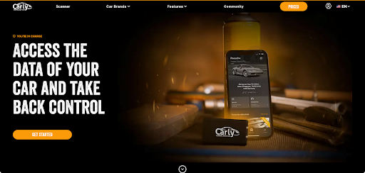
Carly is a mobile application that helps car owners know more about their cars and how they can better utilize them to their fullest potential. The app benefits first-time car owners or people who have purchased new vehicles.
The app’s landing page is interactive and allows users to search for their car models before downloading the app to funnel them into the checkout flow that fits their needs. This personalized process helps users to navigate the app easily after downloading.
Ultimately, your landing page should be easy to navigate, have a robust, simple-to-understand copy, and contain the proper CTAs. Remember that the goal of your landing page is to increase conversions. So, navigating the page should be as effortless and engaging as possible to drive your desired results.

Design Done Better
The easiest way to get affordable, high-quality custom logos, print design, web design and naming for your business.
Learn How to Grow Your Business With Beautiful Design