The Psychology of Perception: How to Use the 8 Gestalt Principles in Visual Branding

Marketers and business owners must understand how people interpret and perceive design. This is especially critical when designing your brand’s visual identity.
By understanding how people perceive visual objects and their arrangements, your business can create visual branding that is more coherent and connects better with your audience.
This is important because the typical human brain processes approximately 11 million bits of information every second and transmits information at nearly 200 miles per hour.
This process happens mostly unconsciously.
Our brains would consume a lot of energy if we were conscious of all this neural activity. So, to conserve energy and operate at maximum efficiency, our brains use inductive reasoning and conditional probability.
These scientific observations led to the Gestalt principles of design, which explain how the human mind organizes and perceives visual information.
This article will delve into each Gestalt design principle and provide their practical applications to help you create a logo, branding, and other visually captivating, original, thoughtful, and memorable designs.
A brief history of Gestalt principles
Gestalt was not a designer. He didn’t even exist.
The Gestalt principles were developed by German psychologists Max Wertheimer, Wolfgang Köhler, and Kurt Koffka in the 1910s and 1920s. Each of them was interested in understanding how humans extract meaningful information and perceptions from chaotic stimuli – our innate desire to seek order in chaos.
The term “Gestalt” is derived from the German word for “shape,” “pattern,” or “structure.” It refers to the overall appearance of something greater than the sum of its parts.
In psychology, “Gestalt” refers to the principles that enable people to perceive order visually.
What is the Gestalt theory of perception?
According to the Gestalt theory of perception, the brain interprets information about relationships and hierarchy in a design or image using visual cues such as similarity, proximity, and closure.
The Gestalt principles provide a psychological framework for understanding how the human mind perceives and organizes visual information.
The critical perception concepts include the following:
- Emergence suggests that to understand the entirety of an object, its parts must first be understood.
- Invariance suggests that people can still identify similar forms regardless of color, scale, weight, or rotation differences.
- Reification posits that even without explicit details, the eye (and the brain) tends to fill in gaps and form forms. This is the concept on which “negative space design”– or creating shapes or images from gaps or white space is based.
- Figure-ground organization believes that the eye organizes forms in 3D and separates their components into background and foreground. The eye can still perceive the background even if the foreground element is flat: everything surrounding the subject is perceived as the background.
- Multistability suggests that the eye will perceive them all simultaneously whenever an ambiguous form can be interpreted in more than one way. In addition, when multiple stability options exist, the eye will travel back and forth between various interpretations. We see this happen in optical illusions.
- Past experience suggests that the interpretation of a form is influenced by the audiences’ individual subjective personal or cultural experiences.
How does all this benefit your goal of building a successful and sustainable brand?
You can use Gestalt principles to inform and help you make design decisions that will turn every element of your branding, website design, and marketing into effective visual communications.
You can use eight Gestalt principles in your visual branding and communication.
8 Gestalt Visual Branding Principles:
The principle of simplicity
Per the first Gestalt design principle, also referred to as “emergence,” people tend to perceive and interpret ambiguous or complex images in their simplest form.
Psychologists believe that when we perceive an object, we first attempt to identify its outline. Only then do we compare it to known shapes and patterns. Eventually, we combine the identified components to construct the whole picture without even being aware we are doing so.
In other words, if presented with an image containing multiple shapes, the mind may select the solution that seems most straightforward, logical, or familiar in its analysis.
It’s vital to use a simple, well-defined design to communicate the desired message more quickly than to use detailed illustrations with ambiguous contours.
How to apply this principle in design:
![]()
For example, let’s examine the Girl Scouts of America logo.
The design consists of irregular shapes with negative spaces in between, but we can also make out three silhouettes within the design.
People who have already seen the image are more likely to perceive it as a single logo than three faces. There is no need for them to pause and think. People see what they see.
The principle of similarity
The principle of similarity is related to simplicity. But, it deals with a different aspect of perception.
Based on this Gestalt design principle, objects with similar characteristics are perceived as being more closely related than objects that do not have similar features.
Our brains naturally group similar objects regardless of their proximity. The similarity between two or more elements can take shape, color, size, texture, or value.
When objects resemble one another, people typically perceive them as part of a pattern or group. The more similar the individual elements are, the greater the sense of coherence.
Using this effect, you can create an illustration, an image, or a message from a series of disjointed elements.
How to apply this principle in design:
![]()
An example can be found in the logo of Sun Microsystems, which consists only of a U and an upside-down U arranged in a loop. It is apparent, however, that when the upside-down “U” s are placed together, they form the word “SUN” on all four sides of the quadrilateral.
You can also use the principle of similarity effectively by deviating from it.
A particular element can be emphasized when it’s dissimilar, breaking the pattern of similarity.
As a result of the divergent elements in a composition, attention is drawn to the break from a pattern of similar elements. This phenomenon is referred to as an anomaly.
![]()
An intriguing example can be found in the logo for the Museum of Contemporary Art (MOCA) in Los Angeles.
There is only one proper letter in the logo, as the remaining letters “M,” “O,” and “A” are substituted with squares, circles, and triangles, respectively.
The black “C” may be perceived as an outlier by their audience, and they may group all the colored shapes, even though they are not adjacent.
Although this logical sequence would typically have taken precedence in any other case, it would be difficult to perceive the “C” and the triangle as a pair and the square and the circle as another pair.
Here, the similarity principle is still at work. The designers of the MOCA logo effectively turned this principle on its head to create an original, thought-provoking, and ultimately intelligent logo.
The principle of proximity
The concept of proximity refers to the spatial relationship between objects based on their proximity or distance from one another.
In particular, the Gestalt Principle of Proximity states that objects close to one another form a collective group even if they are not in direct contact with one another. In addition, this principle holds regardless of whether the proximal objects differ in size, color, or shape.
A unique feature of proximity is that it tends to override other Gestalt principles.
The human eye seems to process a direct correlation between the distance between two objects and how close they are in function to each other.
People tend to link visual elements that are close together to form a cohesive image. However, if things are far apart, people consider them to be doing different things, even if they are visually equivalent.
Take, for instance, words on a page. Letters form a distinct group or a word when a space separates them.
People rely on proper kerning to determine which letters make up individual words in a sentence.
If too many spaces exist between letters, it can be pretty challenging to determine where the end of one word begins and the beginning of the next.
How to apply this principle in design:
We look to the IBM logo to illustrate how the human brain combines each of the adjacent horizontal bars into a single image.
In the IBM logo, three letters are formed by short horizontal lines stacked one atop the other, rather than eight horizontal lines.
![]()
Another approach to using the principle of proximity is when objects placed close to each other do not have to share any characteristics to be perceived as a group.
A logo might consist of 10 or 20 different shapes of varying colors. However, if they are close together compared to other elements, the mind will most likely perceive them as a whole.
![]()
The Unilever logo is an excellent example of this concept at work. What is a bunch of seemingly random, miniature icons quickly reads as a unique logomark because the icons are clustered together to form the letter “U.”
This creative logo incorporates 25 different icons, each representing another aspect of Unilever’s efforts to spread sustainable living across the globe. The designers believe the logo represents the brand’s commitment to sustainability.
The most practical use of proximity in design is establishing visual hierarchy.
Grouping copy together and using white space to show separation between groups helps readers or viewers organize critical information on communication materials such as posters, brochures, and websites.
Regarding contiguous and overlapping objects, our brain seems to prioritize their function to be even more relevant than other objects. An example of this is the logo of Darien Library.
![]()
The designers used the motion of flipping the pages of a book as inspiration (this is a library, after all).
Furthermore, transparent color tints are also used to illustrate a wave, leaves, or a bird’s wing, all of which suggest movement and ascent.
The most practical use of proximity in design is establishing visual hierarchy. People can use white space to organize critical information on communication materials such as posters, brochures, and websites.
The principle of common fate (a.k.a. synchrony)
The most apparent Gestalt principle, synchrony (also known as “common fate”), dictates that elements moving in the same direction are perceived as more related than those moving in different directions.
Regardless of their placement or dissimilarity, elements moving in the same direction are perceived as related.
Common fate often implies motion, which is helpful for designers who emphasize strokes.
How to apply this principle in design:
To illustrate the principle of common fate, let’s look at the AT&T logo.
![]()
The most recognizable AT&T logo has its roots in the 1982 redesign by the renowned graphic design legend Saul Bass. This concept features a solid blue 3D image of a sphere with several white horizontal stripes in a swishing pattern running across it.
AT&T’s logo accurately represents the breadth and scale of the telecommunications leader. The sphere signifies the brand’s global ambitions. The lines represent the wires that connect the organization to the whole planet.
The principle of continuity
The concept of wholeness plays a part in how our brains follow logical directions in visual forms, even when not on a page or design.
Continuity refers to the assumption that elements arranged in a line or curve will continue beyond their defined endpoints. In other words, once our eyes are trained to follow a line or curve, we believe the line will continue in the same direction until it encounters another object.
How to apply this principle in design:
When you understand how the eye will follow and connect separate lines and strokes, you will also be able to maintain the desired cohesiveness of an image or a design.
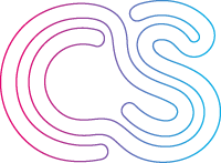
![]()
Look at the crowdspring logo as an example of this principle at work. Because the lines in the letters “C” and “S” are flowing, the eye is drawn to keep looking in the left-to-right direction.
The continuity principle can also apply where a line cuts through an object, aligns perfectly with a secondary element and can point towards another element in the composition.
Our eyes follow a line naturally; when we see an object, we are automatically compelled to move through another object.
This is evident in the PlayStation logo.
![]()
It appears (despite being divided into three parts) as two interconnected letters lying side by side on two vertical and horizontal planes.
The mind’s ability to connect these two is crucial to the success of this logo.
The principle of closure
The human brain is wired to perceive objects as complete regardless of their incompleteness. This is the assumption that the principle of closure is based on.
According to this principle, a partial outline conveys the same message as a complete one.
Despite the absence of parts, the brain will try to match it to a known object as long as the design provides enough information so that viewers can “fill in the blanks.”
Closure could be referred to as the glue that binds elements together. As humans, we are prone to finding and seeking patterns.
The key to achieving perfect closure is to provide enough information to allow the eye to fill in the remaining details. If too much information is given, the need for closure is suppressed.
In contrast, if too little information is given, the eye perceives the elements as separate parts rather than an integrated whole.
In many ways, closure is inextricably related to the concept of reification.
Reification refers to concretizing something, bringing it into being, or making it real. Our brains can construct more information than is present to concur with logic, which is a constructive principle regarding our perception.
This principle can be demonstrated with a simple dotted outline, where people focus on the overall shape rather than a series of disparate short lines.
How to apply this principle in design:
![]()
It is pertinent to note that a logo is not an illustration or a painting. A logo is a visual summary of a brand’s identity and essence.
As a consequence, a logo must communicate in an iconic manner.
This is probably one of the strongest arguments for why logos are known for using the Gestalt closure principle. This is because closure enables the presentation of a figure with minimal visual information.
Take the iconic and very recognizable World Wildlife Fund logo.
Although large portions of the panda’s outline are missing, your brain can quickly fill in the gaps to create a complete image of the animal.
A notable example of the use of negative space is the hidden arrow in the FedEx logo.
![]()
Rather than having its boundary lines, it cleverly leverages the outlines from the letters “E” and “X.” FedEx conveys to its customers, subliminally, that it is a fast, reliable, and forward-thinking company.
The principle of multi-stability
Humans have the strange ability to perceive two figures within a single image based on incomplete information.
A viewer can experience various experiences at the same time when viewing an image since different interpretations are being triggered at the same time.
The principle of multi-stability plays with how our minds perceive optical illusions.
The art of deception, however, lies in the fact that it is impossible to see both interpretations simultaneously. The mind is caught in a dilemma of juggling two ideas and deciding which of them is which.
Eventually, the mind decides to favor one interpretation over another. The longer you look at the dominant image, the more difficult it is for the eyes to intercept other perceptions.
How to apply this principle in design:
One of the most recognizable examples of the principle of multi-stability at work is in the NBC logo. It is characterized by brightly colored segments arranged in an arched pattern.
![]()
However, the logo hides another image within it. They not only resemble the feathers of a peacock (whose head is cut from the middle) but also appear to resemble the sun rising over their morning performance.
Another inspired (and frankly, excellent) use of the multistability principle is in the Pittsburgh Zoo’s logo.
Other than a tree and birds in the foreground of the logo, there are a couple of hidden creatures included too.
You may have to look a few times and eventually see three more animals. Do you see them?
![]()
There are profiles of a lion and a gorilla on either side of the tree. The tree’s canopy and trunk frame their outlines. And then, at the bottom, a pair of fish caught mid-jump.
The principle of symmetry
Humans are very wise creatures, and they respond better when things are presented in an organized manner. A slight misalignment or off-center will irk us to no end.
Thus, it should not be surprising that we are attracted to symmetry and centralization. We find things to look visually pleasing when they line up neatly.
Gestalt’s principle of symmetry plays into this tendency.
People are drawn to objects in symmetrical shapes whenever possible. It is simply human nature to look for order amid chaos. In this regard, one should seek to create balance or symmetry for designs to appeal to people.
Symmetry in logos can provide viewers with an aesthetically pleasing visual quality. This, in turn, also helps reflect or convey balance, trustworthiness, and stability in your brand.
How to apply this principle in design:
It is critical to note, however, that symmetry does not have to be literal to be effective. Creating balance can still be achieved by using a harmonic color scheme or using a similar but not identical group of elements on either side.
![]()
Reflective symmetry
One example is McDonald’s famous golden arches, which are evenly paired and represent the “m” in the company’s name as a monogram.
Translational symmetry
We can see this displayed in Audi’s logo. The silver rings are the same repeating shapes that form the brand’s interlocking chain logo.
Rotational symmetry
Rotational symmetry describes logos where it would always appear the same regardless of how you rotated it. You can find this in several iconic logos such as Walmart, Target, or BP.
Considering how intuitive logo design is, it is hardly surprising that the psychology of sight is so influential.
If you wish to integrate powerful psychology principles, consider incorporating Gestalt principles into your design strategy.
Understanding Gestalt principles allows marketers, business owners, and designers to direct the viewer’s perception with intent and purpose instead of relying on gut instinct.

Design Done Better
The easiest way to get affordable, high-quality custom logos, print design, web design and naming for your business.
Learn How to Grow Your Business With Beautiful Design