7 Photography Logo Styles – Which is Right for Your Photography Business?

Starting a photography business is a balancing act.
Half art, half business… and a whole lot of work.
As a photographer, you know what looks good. And you might be tempted to think that you can choose the best logo for your business without a second thought.
But, logos – like a photography business – are also half art and half business.
Logos are an important part of your photography company’s brand identity. But, knowing what looks good isn’t enough when it comes to choosing the right logo. You’ve also got to consider what makes a logo an effective business tool.
And your logo is only as good as how successfully it communicates to your audience.
So, what should your logo communicate?
A logo exists to visually identify a business brand.
And, to do that, it needs to communicate something unique and memorable about that business.
- Does your business name have a strong visual that the logo can embody?
- Is there a particular feeling that represents your brand?
- Do you offer a unique service or specialty that most other photographers don’t offer?
To build an effective brand strategy, you must find something that differentiates your business (and your brand) from your competition – then use your logo to communicate that.
How does a logo communicate most effectively?
In order to be most effective, a logo must appear anywhere and everywhere you want to promote your business.
This means that it must be able to appear on a wide variety of backgrounds, and in a wide range of sizes, and still be easily recognizable.
As you consider logo options for your business, ask yourself if:
- the design will still look as good when it appears at a tiny size on a business card
- it can appear in a single color on a patterned background and still be recognizable
If the logo looks great at any size, in color or black and white, and can stand up to a busy patterned background, then it’s likely a good choice. But, if it becomes unrecognizable or unreadable, it’s time to try again.
It’s important to understand logo design trends, but it’s equally important to understand different design styles. And, now that you know what to look for in a good logo, here are 7 different logo styles that you may want to consider for your photography logo.
7 Photography Logo Styles:

1. Descriptive style
Studies have shown that descriptive logos are more effective than non-descriptive logos.
The researchers who conducted the study defined a descriptive logo as:
… a logo that includes textual or visual design elements (or a combination of the two) that clearly communicate the type of product or service a brand is marketing.
As a photographer, this means that your logo should make it evident that you are, in fact, a photographer.
A descriptive logo allows people to identify your business as a possible solution for their problem, need, or interest.
Here’s a great example. The clean, line art shutter graphic, combined with the business name “Bottle Portraits,” makes it very clear that this is a photography business.

Logo design by crowdspring creative Djiribogh
The photographer, based in Napa Valley, specializes in high-end wine bottle portraiture. The bottle centered within the shutter describes exactly what they photograph.
This descriptive logo would communicate to their ideal clients, people who run wineries in Napa Valley, that Bottle Portraits provides a service they need.
When choosing a logo for your photography business, aim to leave no question in your clients’ minds that you are the photographer for them.

2. Visual puzzle style
Some of the most memorable logos present a visual puzzle – a combination of images that reveals a hidden meaning when you look a bit deeper.
These playful logos may confuse people at first. Viewers may ask themselves, “What am I looking at?”
This extra processing time helps to hold their attention on your business.
And, once they decipher the hidden meaning of the logo, they’re rewarded by feeling clever for having solved the puzzle. This delivers a positive association with your photography business. After all, everyone likes to feel like they’re “in” on a secret.
But, you don’t have to take our word for it. A recent study investigated how the human brain responds when people solve a creative puzzle. Researcher Christian Windischberger explains:
…our research results showed sudden and significantly greater activation of the nucleus accumbens when the solving of a puzzle is accompanied by an ‘Aha!’ moment and hence a moment of intense joy and relief.
Solving a puzzle makes people feel good. Their research also revealed that an “Aha!” moment “facilitates long-term memory storage.”
So, if your logo can inspire an “Aha!” moment, then it’s more likely to be remembered.
The logo below is one such visual puzzle. We’ll let you take a moment with it before we reveal the details…

Logo Design by crowdspring creative Cess
Did you notice that the camera lens is a mug of coffee?
This logo icon combines two unique elements of the business – photography, and coffee. And, the combination is subtle enough that casual viewers may not notice it at first.
But, once they have that “Aha!” moment, it’s impossible to unsee. And, the people who have that moment are likely to remember this business in a positive way.
It’s every business’s goal to be remembered positively.
This logo style requires creativity and finesse to pull off. But, if you’re up to the challenge, it might be the perfect style for your photography business.
3. Modified logotype style
Logotypes (logos made up of words with no accompanying icon) lean hard into the territory of “business-like.”
They’re straightforward, and often less creative or whimsical than logos with icons.
So, they may not be the first logo style you’d think of for a creative business like photography.
But, they do have their place – the question is, is that place representing your brand?
If you’re seeking elite clientele or business clients who respond well to this no-nonsense style, then a logotype may be a perfect fit for your photography business.
But, it’s important to choose the font wisely (to reflect your brand). It’s also a good idea to consider customizing the font (rather than using a stock font) to ensure the logotype can be trademarked.
Even if your brand does lean toward the whimsical or casual end of the spectrum, you can opt for a modified logotype to better reflect your creative brand.
For example, check out this logo from the drone videographers and photographers at SkyLand.
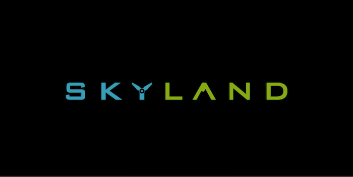
Logo design by crowdspring creative IM3D
This logotype is simple, modern, and playful in its use of bright colors, a drone propeller standing in for the “Y” in “sky,” and a mountain silhouette hiding in the “A.” Together, the propeller and mountain signify sky and land.
There may be a simple way to modify a logotype to perfectly embody your brand, too.
4. Monogram style
Monograms are a classic logo style.
They communicate brand identity in shorthand (just the business’s initials) while also creating a versatile logo icon that can be used on many backgrounds.
In fact, monogram logos are so commonplace that they’re one of the styles people consistently think of when asked to imagine a logo.
But, while the market is already saturated with unoriginal monogram logos, there’s always a place for creative and brand-appropriate monograms.
The logo below for photobooth company BoothCo, features a dynamic and colorful monogram.
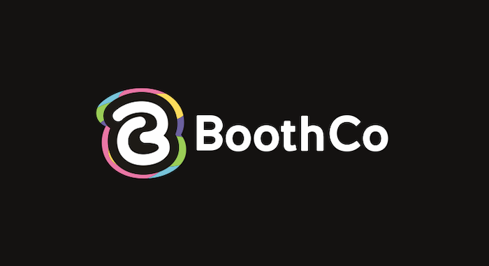
Logo design by crowdspring creative Nhr
The colorful outline surrounding the letters B and C creates a unique shape, independent of the letters themselves – making this logo versatile enough to remain recognizable on just about any background.
And, the vibrant colors and hand-drawn letter styling make the logo feel youthful and fun – which tells you something about the company.
If you opt for a monogram-style photography logo, be sure to think in terms of the overall shape as well as the emotional impression the monogram creates.
5. Conceptual/feeling style
Photography is an evocative medium that captures feelings as well as concrete objects, people, and moments in time.
Depending on your personality and brand, an evocative, conceptual logo may be a great fit for your photography business.
Conceptual logos are designed to capture the feeling or essence of a business. They help people imagine how it might feel to do business with you.
And, since emotions tend to drive people’s decision-making, communicating the right emotion in your logo can be a compelling branding and sales tactic.
Let’s take a look at the logo below to see how this might play out in practice…
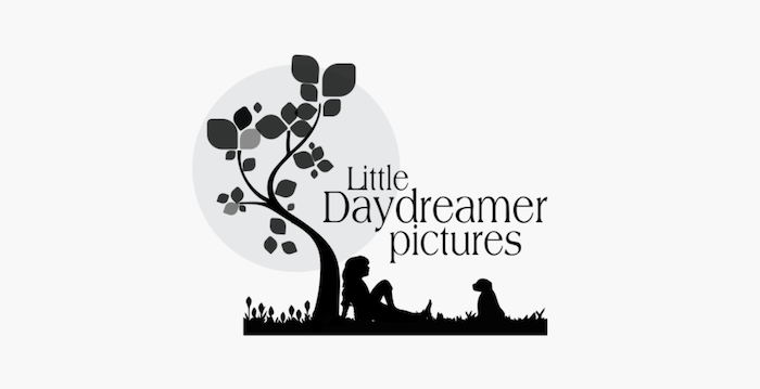
Logo design by crowdspring creative Bekk
This logo for Little Daydreamer Pictures shows a girl sitting under a tree with her dog. There’s nary a camera, shutter, or viewfinder image in the logo. It’s not your stereotypical photography logo.
But, the image does convey a feeling of relaxation and peace. When people see this logo, they’ll associate those feelings with the business itself.
Many people like to feel relaxed and peaceful. And, those people will be attracted to this photographer when they find they need one.
Is there a particular feeling you like to evoke during your shoots or with your photos? If so, perhaps a conceptual logo is the right fit for your photo business.
6. Negative space style
As a photographer, you know that your business is all about carving shapes out of the darkness with light.
Negative space logos take that same approach.
Negative space is an area left unfilled in a design. All logos have some sort of negative space. But, some designs creatively use the negative space to create a shape with deeper meaning.
Depending on how prominent or subtle the negative space shape is, this logo style can also fall under the heading of a visual puzzle logo (as we described above).
This logo for Hidden Fox Photography features a negative space fox silhouette prominently incorporated into the landscape behind it.

Logo design by crowdspring creative Amadeus8
Remember, as we mentioned above, a logo needs to communicate something specific and unique about the brand it’s representing. In this case, a negative space fox is an ideal representation for this brand’s namesake – Hidden Fox.
Single-color, negative space logos like this one can be an excellent opportunity to reveal a unique element about a photography brand using photography’s prime tools of light and dark.
What unique brand element would you showcase in a negative space logo?
7. Show-what-you-shoot style
For some photographers, a logo featuring a camera, or photography gear is too… shall we say, “expected?”
If that’s you – and you shoot a specific, unique subject matter – consider making your subject the focus of your logo.
This is another form of descriptive logo. It shows your potential customers exactly what you shoot, so clients who need your service can easily identify you.
And, depending on how unique your subject matter is, there’s a good chance that your logo will stand out from other photography logos.
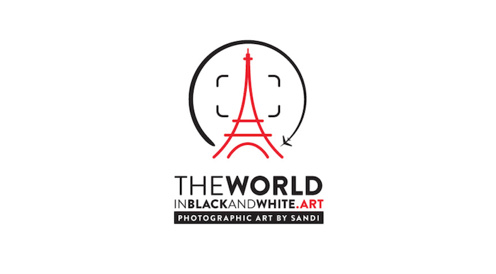
For instance, this logo for The World in Black and White features the Eiffel Tower.
Logo design by crowdspring creative Ben9
Showcasing an iconic travel destination and including a subtle airplane in the framing semicircle, this logo shows exactly the sort of subjects this photographer shoots.
It also helps that the business name supports that message loud and clear.
If you feel a deep connection with your subject matter, then leading with a logo that shows what you shoot could be the right choice for you.
Design Done Better
The easiest way to get affordable, high-quality custom logos, print design, web design and naming for your business.
Learn How to Grow Your Business With Beautiful Design
