5 Hot Logo Design Trends That Can Improve Startup And Small Business Brands

{{CODE2000000}}
It’s no surprise that new business owners want their company’s logo to be memorable.
They want their brand to stand out, their brand identity to be recognizable, and for their logo to convey their company’s personality and purpose. As we wrote previously:
Brand awareness reflects the degree to which customers or potential customers can recognize or recall a brand and correctly associate that brand with a specific product or service. Creating brand awareness is one of the key components in promoting a product or service.
Today, small businesses and startups have to compete in an increasingly noisy world against larger, more established businesses.
To do so, they need to get noticed.
Customers who are just discovering your brand need something to remember you by, and your logo serves as a kind of souvenir for them to hold on to.
Customer preferences and markets change over time, so it’s important to understand trends before you settle on your brand.
We’re not suggesting you follow fads.
For example, it was trendy to have 3D animated logos, but those were impossible to print and often very difficult to read.
Lasting trends help you to better shape and define your brand. Fads can lead you astray and require an inevitable rebrand.
>>If you’re interested in current logo trends, look at logo design trends for 2022.
Before we look at the current hot trends in logo design, here are some key principles to keep in mind for getting a great logo that reflects your brand (we’ve listed 4 key principles below, but you can see all 10 in Create a Successful Logo With These 10 Essential Elements:
- A logo should be simple: logos conveying a strong idea with minimal detailing.
- A logo should be versatile: a logo that works equally well across different platforms and devices.
- A logo should be appropriate: your logo’s design should convey your brand in a befitting fashion.
- A logo should be unique: your logo should set you apart from your competition.
A well-executed logo will help your business appear professional, sharp, and interesting.
A bonus? It’s an easy way to get your brand’s personality across to your customer in those first critical moments of making a first impression.
Now, some business owners worry that the cost of logo design can be prohibitively high.
Many design companies and agencies indeed charge thousands to tens of thousands of dollars for their services. But this isn’t universally true (crowdspring’s custom logo design projects start at just $299, including all fees).
First impressions are very important. As we wrote previously:
People have a very short attention span. In fact, according to a Princeton University study, snap judgments count. The study found after seeing a face for only 1/10th of a second people formed opinions about that person. Judgments were made on attractiveness, likeability, and trustworthiness, and prolonged exposure to that face just reinforced the initial impression.
The same goes for websites. Three studies found that a mere 50 milliseconds were all people needed to form an opinion about a website. Google performed similar testing and found an even slimmer margin: a speedy 17 to 50 milliseconds were all people needed to decide how they felt about a website.
And this is also true for logos:
After all, memorable logos are 13% more likely to get consumers attention, and 71.6% more likely to get a positive response from consumers. In a world of noise, that can make a big difference.
Here are 5 hot trends and inspirations to help you sharpen your brand’s logo, ensuring that you nail that first impression.
1. Minimal design
Simple designs are popular because they are eye-catching, memorable, and timeless. Less is often more, and nowhere is that truer than with a minimalist design.
The minimalism trend grounds most of the other current trends, which are increasingly focused on sleek, tight designs.
Ornate, overworked design has been replaced with cleaner, modern concepts that retain simplicity while still functioning as creative pieces.
One reason for minimal design’s broad-based appeal? Any business can incorporate a minimal look into their existing design scheme!
If you find that your existing brand is tired and out of touch, maybe it’s time to look at what other businesses are doing with minimalist design.


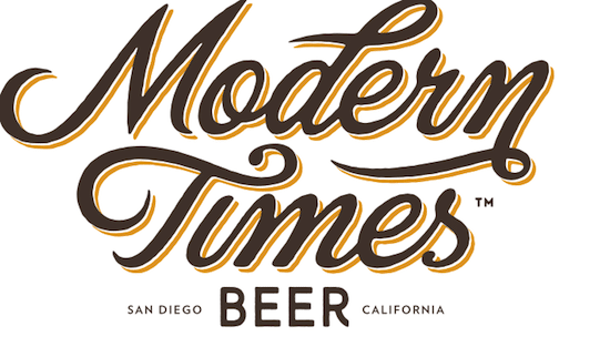
2. Hand-drawn and text
If the goal of minimal logos is to communicate a brand simply and clearly, hand-drawn and text logos (also known as logotypes) strive for a similar clarity. These logos are often personal, intimate, and informal in a way that minimalist logos are not.
One industry that uses handwritten logos extensively is craft breweries, and for a good reason. Small breweries are known for the artisanal, handmade nature of their products, and a handwritten logo helps reaffirm that quality.
What could be more personal than someone’s handwriting?
All-text logos are another way for companies to differentiate themselves in a simple yet refined way.
One example of this in action is coworking collective WeWork, with an all-text logo that is no-nonsense and clear. There’s nothing to get in the way of the brand name, and that clarity helps reinforce that they’re an uncomplicated and accessible organization.


And if you look at crowdspring’s logo at the top of your browser window, you’ll see that it’s just text.
3. Line art
Line art logos are exactly that: logos made up of lines. They are frequently paired with a logotype or some other text, and the combination can feel modern and abstract in an elegant way.
There are several benefits of using line art in a logo: They are usually easily adaptable to all kinds of platforms and media, from mobile app and websites to print and even billboards. They are often simultaneously simple and complex and can be tailored to communicate particular branding needs so that another style cannot.

Most importantly, they can be concise, immediate, and memorable, and done correctly; they can often stand alone from a wordmark as a self-contained branding element.


4. Black and white
Black and white logos exude sophistication, luxury, and elegance.
Small businesses and larger companies can use black and white to convey a sense of refinement and style. And of course, the vast majority of the time, when your logo appears in print, it will be in black and white (so make sure that your logo works well in black and white, even if it has color in it).
The black and white trend can serve as a variation of your current logo. You’re not mandated to use each iteration of your logo on all platforms, but it’s nice to have choices – some logo color schemes work better in different spaces, particularly in the age of social media.
Black and white logos look sharp anywhere they’re used, so having a logo that translates well in black and white works to your advantage.


5. Negative space
Negative space is a design style based on dual imagery. Using both positive and negative space to join multiple images into one cohesive piece, you create an engaging and intriguing logo.
This logo design style has emerged as a breakout trend in 2017, not only because these logos are clever but because they have a high recall value.
With their immense visual impact, these logos cement your brand in a consumer’s memory, making it easier for them to remember you later on.
There have been some memorable negative space examples in the past, including the FedEx logo.
If you didn’t see it already: the negative space between the ‘E’ and the ‘x’ forms an arrow symbolizing movement and precision. Which are of course two very important values for a logistics company such as FedEx.

The Toblerone logo is another great example of using negative space.
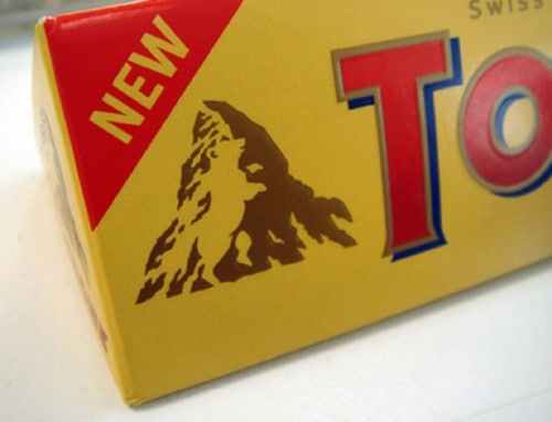
We wrote previously why we love the Toblerone logo:
First of all… it’s Chocolate. Mmmm. Second of all, a bear (symbol of the city of Berne, where Toblerone is produced) is hidden in the modern version of the Matterhorn mountain logo. The Matterhorn is a great symbol of Switzerland, and is said to possibly be the inspiration for the shape of the candy bar.
If you’re a business owner seeking to grab your customer’s attention, the use of negative space gives your logo an eye-catching, provocative edge.
Martin Newcombe Property Maintenance


You can probably see a trend in the trends: Simplicity and clarity are key components to any successful logo.
And, of course, logos have become more important than ever. According to Fortune:
A logo isn’t just a name or an icon or other visual signature on company letterhead or a billboard or other promotional venue anymore. Take that device out of your pocket or bag and swipe through the screens, as you probably do many times a day anyway. You now carry dozens of brand icons wherever you go. “People are literally, physically interacting with those symbols in a way that they never did,” says Michael Bierut, partner in the prominent design firm Pentagram.
A great logo walks the line between timelessness and trendiness: designing both can be a challenge. A logo that’s unique, attractive, adeptly communicates your brand values requires an understanding of the current design trends, like the ones listed here.
Look for a designer who can tailor these trends to suit your business’s unique image and personality.

Design Done Better
The easiest way to get affordable, high-quality custom logos, print design, web design and naming for your business.
Learn How to Grow Your Business With Beautiful Design